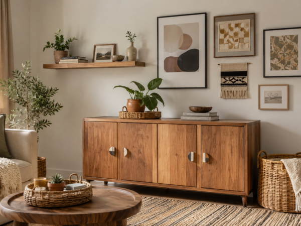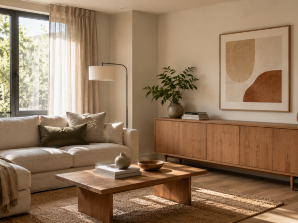
Choosing a colour scheme for drawing room starts with the room’s size, natural light, furniture, and the mood you want to create. A simple approach is to choose one main colour, one supporting colour, and one accent shade. For example, warm white walls with beige furniture and muted green accents can create a calm and welcoming room. If the room is small or receives little daylight, lighter colours usually help it feel more open. Larger or brighter rooms can handle deeper shades more easily. The key is to coordinate the walls, sofa, curtains, rug, and accessories instead of choosing every colour separately.
Start With the Room You Already Have
Before choosing paint or buying new decor, look at the drawing room as a whole.
The existing sofa, flooring, curtains, doors, windows, lighting, and large furniture pieces already contribute colours to the room. These elements should influence your palette.
If your sofa is already brown, for example, you do not need to replace it just because you want a new colour scheme. Instead, you can build around it with cream, beige, warm white, olive, terracotta, or another compatible accent.
Start by identifying three things:
- The dominant colour already present
- The secondary colour you want to introduce
- A small accent colour for visual interest
This prevents the common mistake of choosing wall paint first and then struggling to match everything else.
Understand the 60 30 10 Approach
A useful way to organise colours is the 60 30 10 approach.
It does not mean you have to measure the room precisely. It simply gives you a visual balance.
Main colour
The main colour covers most of the visual space. In a drawing room, this may be the wall colour, large rug, or another major surface.
Soft white, cream, beige, light grey, greige, and other muted shades can work well as main colours.
Supporting colour
The supporting colour adds more character. It may appear through the sofa, curtains, rug, or a large piece of furniture.
For example, a room with cream walls could use a taupe sofa and natural wood furniture.
Accent colour
The accent colour should be used more selectively.
You might introduce it through:
- Cushions
- Artwork
- Vases
- Throws
- Decorative objects
- Small chairs
- Flowers or plants
- A feature wall
Using the accent colour in several small places can make the room feel coordinated without overwhelming it.
Consider Natural Light Before Choosing Colours

Natural light can change how a colour looks throughout the day.
A shade that looks soft and warm in a paint shop may look different beside your windows. Before committing to a colour, test it in the actual room.
Look at the colour:
- In morning light
- Around midday
- In the evening
- Under your regular artificial lighting
This is especially important for darker shades.
A drawing room with large windows and plenty of daylight can usually accommodate stronger colours more easily. A darker room may benefit from lighter walls and reflective surfaces.
If the room receives limited natural light, consider shades such as:
- Warm white
- Cream
- Soft beige
- Pale greige
- Light taupe
- Soft pastel tones
These can help the room feel lighter without requiring an entirely white interior.
Choose a Colour Based on the Mood You Want
Colour should support the way you want the drawing room to feel.
A formal drawing room may suit a more restrained palette. A family oriented space may feel better with warmer and softer combinations.
For a calm drawing room
Try combinations such as:
- Cream + beige + muted green
- Warm white + taupe + brown
- Soft grey + white + dusty blue
- Sand + ivory + olive
These combinations keep the overall appearance relaxed.
For a warm drawing room
Consider:
- Beige + terracotta + cream
- Warm white + caramel + brown
- Taupe + rust + ivory
- Cream + muted mustard + natural wood
Warm colours can make a room feel more comfortable and inviting.
For an elegant drawing room
A restrained palette can create a more polished appearance.
Consider:
- Ivory + charcoal + brass toned accents
- Warm white + deep green + wood
- Greige + dark brown + cream
- Soft grey + navy + white
The important point is not to use every colour at full strength. Strong colours usually work better when balanced with quieter shades.
Use the Sofa as a Starting Point
The sofa is often one of the largest visual elements in a drawing room, so it can be a useful starting point.
If your sofa is neutral, you have more flexibility.
A beige sofa can work with:
- Cream
- White
- Brown
- Olive
- Terracotta
- Dusty blue
A grey sofa can work with:
- White
- Black
- Navy
- Soft blue
- Green
- Warm beige
A brown sofa can work with:
- Cream
- Beige
- Olive
- Rust
- Warm white
If your sofa already has a strong colour or pattern, keep the surrounding palette simpler.
Instead of adding several competing colours, use neutral walls and repeat one or two colours from the sofa through cushions, artwork, or accessories.
Match Wall Colour With Furniture
The wall colour does not need to match your furniture exactly.
In fact, exact matching can sometimes make the room look flat.
Instead, look for relationships between colours.
For example, a warm beige wall can complement a darker brown sofa while creating enough contrast to separate the two.
If your furniture is dark, lighter walls can create balance.
If your furniture is very light, a slightly deeper wall colour can add definition.
For a small drawing room, keeping the walls and larger furniture within a related light to medium colour family can help create a more connected appearance.
Coordinate Curtains With the Colour Scheme
Curtains occupy a large visual area, so they should be considered part of the overall palette.
You can either blend them with the walls or use them to introduce a supporting colour.
For example:
Warm white walls + beige sofa + beige curtains + olive cushions
creates a quiet, layered palette.
Another approach is:
Cream walls + neutral sofa + muted blue curtains + blue accessories
which creates a stronger colour connection.
Avoid choosing curtains based only on whether you like the fabric. Consider how their colour interacts with the walls, sofa, flooring, and daylight.
If the room already contains several patterns, plain curtains are usually easier to coordinate.
Add Colour Through Rugs and Textiles
You do not have to use paint to introduce colour.
Rugs, cushions, throws, and curtains can change the appearance of a drawing room without major renovation.
This is useful if you live in a rental or want an affordable update.
For example, a neutral drawing room can be refreshed with:
- A patterned rug
- Two or three accent cushions
- A coloured throw
- Artwork with repeated accent shades
The advantage is flexibility. If you become tired of the accent colour, you can replace smaller textile pieces rather than repainting the room.
Use the Floor as Part of the Palette
Flooring is easy to overlook when planning a colour scheme.
Wood flooring, tiles, stone, and carpets all have their own undertones.
A floor with warm brown tones can work naturally with cream, beige, tan, terracotta, and olive. A cooler grey floor may pair more easily with soft grey, white, blue, charcoal, or certain green tones.
You do not need every element to have the same undertone, but the colours should not feel like they are fighting each other.
If the floor has a strong pattern, keep other large surfaces relatively simple.
Create a Small Drawing Room Colour Scheme
Small rooms need careful colour control.
That does not mean you must use plain white everywhere.
Instead, avoid dividing the room visually into too many separate colour blocks.
A useful approach is to keep the main surfaces light and introduce colour through smaller elements.
For example:
Option 1: Soft and natural
- Walls: warm white
- Sofa: beige
- Curtains: cream
- Rug: light neutral
- Accents: olive green
Option 2: Cool and clean
- Walls: soft grey
- Sofa: light grey
- Curtains: white
- Rug: neutral
- Accents: muted blue
Option 3: Warm and traditional
- Walls: cream
- Sofa: brown
- Curtains: beige
- Rug: neutral pattern
- Accents: terracotta
Using fewer dominant colours helps a small room feel visually connected.
Make a Large Drawing Room Feel Balanced
Large drawing rooms can handle stronger colour combinations, but size alone does not mean you should use many colours.
A large room can feel disconnected if every section has a different palette.
Instead, repeat colours throughout the space.
For example, if you choose deep green as an accent, repeat it in:
- Cushions
- Artwork
- Plants or planters
- A chair
- Decorative objects
This creates visual links between different areas.
You can also use a deeper colour on one wall if you want to create a focal point.
Try a Neutral Colour Scheme
Neutral colours remain useful because they provide flexibility.
A neutral drawing room does not have to look boring.
Layer different shades and textures instead.
For example:
- Warm white walls
- Beige sofa
- Taupe curtains
- Natural wood table
- Cream rug
- Brown accessories
- Green plants
The interest comes from differences in texture, shape, and tone rather than from many strong colours.
This approach also makes future updates easier because you can change accent colours without redesigning the entire room.
Add One Strong Accent Colour
If you prefer a simple room but still want personality, choose one noticeable accent.
For example, a neutral drawing room could use:
- Deep green
- Navy
- Terracotta
- Mustard
- Dusty blue
- Rust
Use the accent selectively.
A navy cushion, artwork, vase, and chair can create a stronger connection than covering the room with several unrelated colours.
The goal is repetition, not saturation.
Use the Colour Wheel Without Making It Complicated
You do not need advanced colour theory to create a balanced room.
Three basic relationships are useful.
Similar colours
These are colours that sit close to each other visually.
Examples include:
- Beige + cream + tan
- Blue + dusty blue + soft grey
- Green + olive + sage
These combinations tend to feel cohesive.
Complementary colours
These create stronger contrast.
For example, blue and orange sit opposite each other on a traditional colour wheel. You can use a muted version of one colour with a small amount of the other rather than using both at full intensity.
Neutral plus accent
This is often the easiest approach.
Choose a neutral base and add one stronger colour.
For example:
Cream + beige + olive
or
Warm white + grey + navy
This gives you a clear direction without making the room visually complicated.
Test Your Colours Before Committing
Paint samples are more useful than choosing a shade from a screen.
Place your sample near:
- The sofa
- Flooring
- Curtains
- Windows
- Main furniture
Look at it at different times of day.
If you are combining several colours, test them together rather than individually.
A colour that looks attractive by itself may not work next to your flooring or furniture.
Common Colour Scheme Mistakes
Choosing too many colours
A drawing room can become visually noisy when walls, curtains, furniture, rugs, cushions, and accessories all introduce different colours.
Choose a limited palette and repeat it.
Matching everything exactly
Using the same colour everywhere can make the room feel flat.
Instead, use related shades and different textures.
Ignoring undertones
Two beige colours can look completely different if one has a warmer undertone and the other feels cooler.
Check colours next to each other before making a final decision.
Choosing dark colours without considering light
Deep colours can look dramatic, but they may make a poorly lit room feel heavier.
Consider the amount of daylight before using them across large surfaces.
Buying decor before choosing the palette
Small decorative pieces are easier to replace than major furniture.
Choose the overall palette first, then buy accessories that support it.
Using accent colours randomly
An accent colour works better when it appears in several places.
If you choose olive green, repeat it in small ways rather than using one isolated green object.
Budget Friendly Ways to Change the Colour Scheme
You do not need a complete renovation.
Free
Start by rearranging existing items.
Move artwork, cushions, throws, lamps, and decorative objects around the room. Group items by colour and remove pieces that introduce unrelated shades.
Low cost
Focus on small changes such as:
- Cushion covers
- Throws
- Small vases
- Artwork
- Decorative storage
- Plant pots
These can introduce an accent colour without changing the furniture.
Moderate cost
Consider updating:
- Curtains
- Rugs
- Lampshades
- Accent chairs
- Wall paint
These changes have a stronger visual effect.
Higher cost
For a larger transformation, you might change:
- Sofa
- Flooring
- Built in storage
- Major furniture
- Multiple wall treatments
Do these last. There is little value in buying expensive furniture before you know the colour palette you want.
A Simple Step by Step Method
If you are starting from scratch, follow this order.
Step 1: Check the room
Look at natural light, floor colour, room size, and existing furniture.
Step 2: Choose the mood
Decide whether you want the space to feel calm, warm, elegant, fresh, or dramatic.
Step 3: Pick the main colour
Choose a shade for the largest visual surfaces.
Step 4: Add a supporting colour
Use it for furniture, curtains, rugs, or another large element.
Step 5: Choose one accent
Keep the accent colour limited to smaller details.
Step 6: Repeat the accent
Use it in at least a few different areas so the room feels connected.
Step 7: Test the combination
View the colours in natural and artificial light.
Step 8: Buy slowly
Start with smaller pieces before making expensive changes.
This method reduces the chance of ending up with a room full of colours that looked good individually but do not work together.
Final Checklist Before You Choose
Ask yourself:
- Does the wall colour work with the flooring?
- Does the sofa fit the palette?
- Do the curtains support the room rather than compete with it?
- Is there one clear accent colour?
- Are strong colours being used selectively?
- Does the room receive enough natural light for the chosen shades?
- Does the palette still look good under artificial lighting?
- Can smaller accessories be changed easily later?
If the answer is yes to most of these questions, you have a practical starting point for your drawing room.
FAQs
Should the drawing room ceiling be the same colour as the walls?
It can be, but it does not have to be. A lighter ceiling can help maintain a bright, open appearance, while a related shade can create a more layered look.
Can I use two different wall colours in one drawing room?
Yes. Two colours can work when there is a clear reason for the division, such as highlighting a feature wall or visually separating areas. Keep the colours related to the rest of the room.
What colour works with both modern and traditional furniture?
Soft neutrals such as cream, warm white, beige, and some greige shades can work across different furniture styles. The final result depends on the specific undertones and surrounding colours.
How can I change my colour scheme without painting?
Change textiles and smaller decor first. Cushion covers, curtains, rugs, artwork, throws, and accessories can introduce a new palette while leaving the walls untouched.
Should artwork match the drawing room colours?
It does not need to match exactly. However, repeating one or two colours from the artwork elsewhere in the room can make the overall design feel more connected.
Can black be used in a drawing room colour scheme?
Yes. Black can work as an accent through frames, lighting, furniture details, or accessories. Using it selectively can add contrast without making it the dominant colour.